 1 / 3
Minimal Black White New Home Card for a Simple Celebration
Minimal Black White New Home Card displays a simple typographic design with a heart accent to celebrate a fresh start in a new space.
Shipping from $3.95
- Arrives in 5–9 business days$3.95 shipping · Free over $25 · Order before 2 PM ET to ship sooner
- 30-day returnsUnwritten cards, original condition. Learn more
- Secure checkout: cards & PayPal
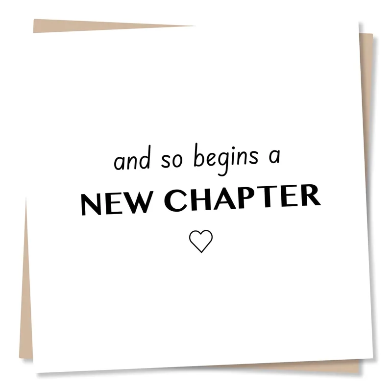
Minimal Black White New Home Card shows the phrase HAPPY new HOME. in a striking black-on-white layout. The words are arranged vertically with a mix of bold sans-serif capitals and a fluid lowercase script for the middle term. A tiny heart shape sits at the end of the sentence, acting as a punctuation mark that adds a touch of warmth to the otherwise graphic style. This visual approach turns a standard congratulation into a piece of modern art that respects the recipient's taste for simplicity.
Ships with a kraft envelope; envelope color in photo may vary.
What is printed on it
The artwork relies entirely on typography to convey its message, avoiding any illustrations of houses or keys. The word HAPPY appears in thick, uniform strokes that feel solid and grounded. Below it, the word new flows in a handwritten style that softens the overall look. The final word HOME returns to the bold print but ends with a deliberate, hand-drawn heart. This combination of rigid structure and organic writing creates a balanced composition that belongs to the category of modern graphic design. It captures the excitement of a new beginning through form rather than imagery.
Made for these people
A Minimal Black White New Home Card appeals to the friend or family member who finds traditional housewarming cards too busy or cutesy. You might choose this for a son or daughter stepping into their first apartment, or a colleague starting a new chapter in a different city. The clean aesthetic works well when paired with a sleek gift or simply sent as a standalone note of support. It validates their new space without trying to decorate it for them.
- How does the typography change the meaning of the message?
- The mix of block letters and script transforms a standard greeting into something more personal. The bold caps suggest stability and strength for the new foundation, while the cursive new implies a smooth, flowing transition. This typographic contrast communicates that the move is both a solid achievement and a gentle new experience.
- Who specifically gets the reference from this design?
- This design targets individuals who appreciate modern minimalism and graphic design. It suits those who have just moved into a stylish apartment or home and want a card that matches their interior decor. If they dislike floral patterns or cartoon houses, this stark, text-only approach will likely resonate with their specific aesthetic preferences.
- What makes this different from other housewarming cards?
- Unlike traditional cards featuring illustrations of keys, houses, or balloons, this design uses negative space and font weight to create impact. The absence of imagery forces the reader to focus solely on the sentiment. This makes it distinct because it treats the greeting as a statement of fact rather than a decorative illustration.
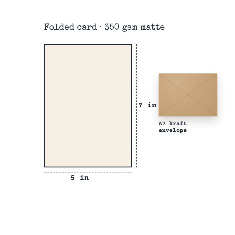
- Premium 350 gsm cardstock
- Full-color print on demand (front)
- Folded 5 x 7 in (A7) card
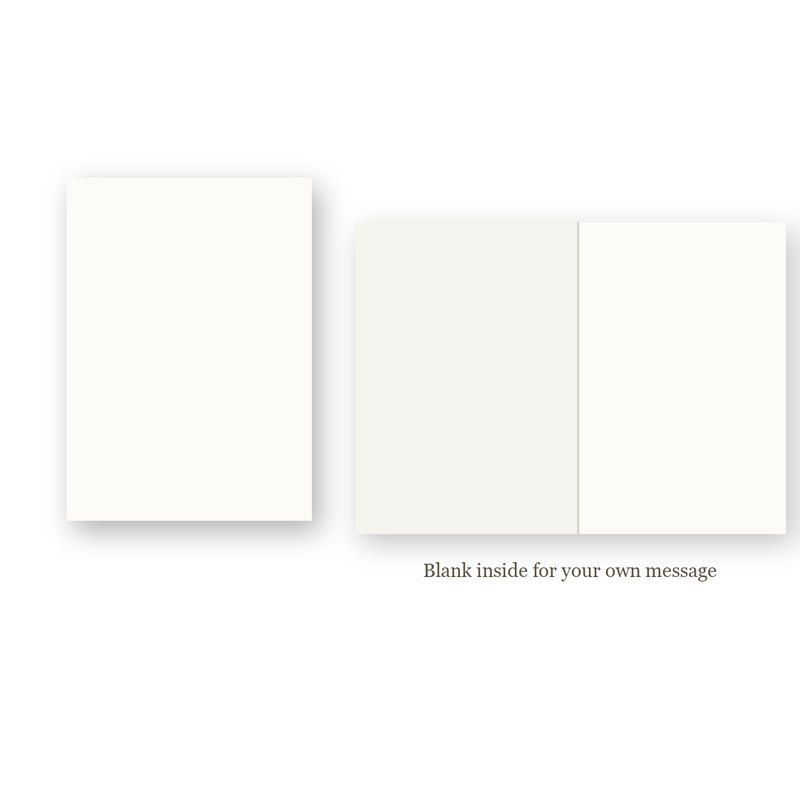
- Blank inside for your own message
- Kraft envelope included
- Printed to order
- Paper weight: 350 g/m²
$3.95 flat shipping per order, free on orders of $25 or more. Cards are printed to order: 2–4 business days to print and pack, then 3–5 business days in transit (5–9 business days in total). We ship within the United States only.
Return unwritten cards within 30 days of delivery. Damaged or misprinted? We replace or refund it free. Read our Shipping Policy and Returns & Refund Policy.