 1 / 3
Typography Red Heart Thank You Card for Expressing Deep Gratitude
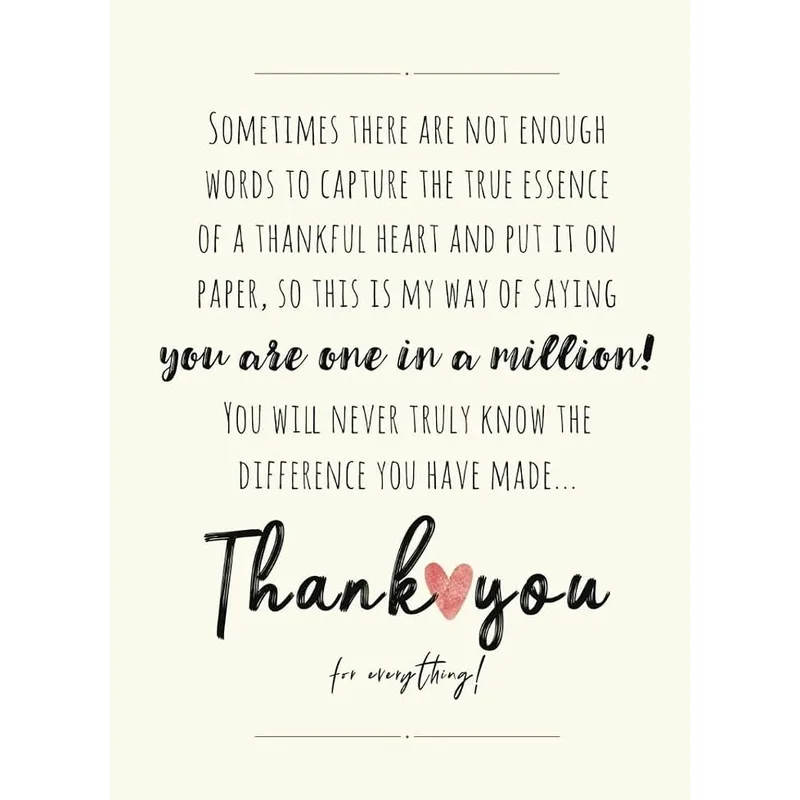
Typography Red Heart Thank You Card uses elegant brown typography and a red heart to convey that saying thank you never feels like enough.
Shipping from $3.95
- Arrives in 5–9 business days$3.95 shipping · Free over $25 · Order before 2 PM ET to ship sooner
- 30-day returnsUnwritten cards, original condition. Learn more
- Secure checkout: cards & PayPal
Typography Red Heart Thank You Card shows the phrase NO MATTER HOW MANY TIMES I SAY thank you IT NEVER FEELS LIKE ENOUGH with a red heart outline. The design acknowledges that standard gratitude often falls short of true appreciation. Sending this card validates complex feelings of indebtedness, and it is perfect for mentors or anyone who has made a lasting impact on your life.
Ships with a kraft envelope; envelope color in photo may vary.
What the design tells
The artwork centers on the word thank you rendered in a sweeping, metallic bronze script that dominates the middle of the white space. Above and below this focal point, the remaining sentence appears in clean, black sans-serif capital letters that frame the cursive element. Three small sparkle icons float around the script text, adding a touch of whimsy to the serious sentiment. A thin red line forms a classic heart shape at the bottom center, anchoring the composition. This layout belongs to the category of heartfelt appreciation cards where the visual hierarchy emphasizes the emotional weight of the word thank you over decorative patterns.
People who will use it
Those who struggle to find the right words for significant acts of kindness will appreciate this specific phrasing. A teacher receiving this during end-of-year celebrations understands exactly why the text was chosen. It serves as a tangible reminder that their efforts have been seen and deeply valued. This card works well for acknowledging a coworker’s help or a family member's support when a simple sticker feels inadequate.
- Why does the card use both block letters and script for the main message?
- The contrast between the rigid block text and fluid script visually represents the tension between trying to express thanks and feeling inadequate. The bold uppercase letters state the premise clearly, while the artistic lowercase thank you carries the emotional weight. This typographic choice reinforces the idea that while the act of speaking is simple, the feeling behind it is complex and beautiful.
- Who specifically benefits from the phrase IT NEVER FEELS LIKE ENOUGH?
- This design suits people who have received substantial help from a mentor, counselor, or long-term friend. It targets individuals who feel their gratitude is too large for a standard note. If you know someone who constantly gives without expecting return, this card validates their impact by admitting that verbal thanks can never fully capture the value of their contribution to your life.
- How does the red heart complement the brown typography in this specific design?
- The red heart provides a necessary pop of color that signals love and passion amidst the neutral brown and black palette. While the brown script suggests warmth and sincerity, the red outline ensures the emotion is unmistakable. This pairing prevents the design from looking too corporate or formal, keeping the focus on the personal connection between the sender and the recipient.
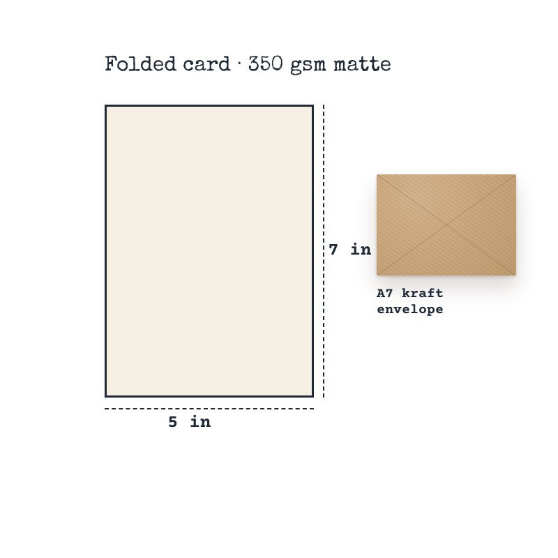
- Premium 350 gsm cardstock
- Full-color print on demand (front)
- Folded 5 x 7 in (A7) card
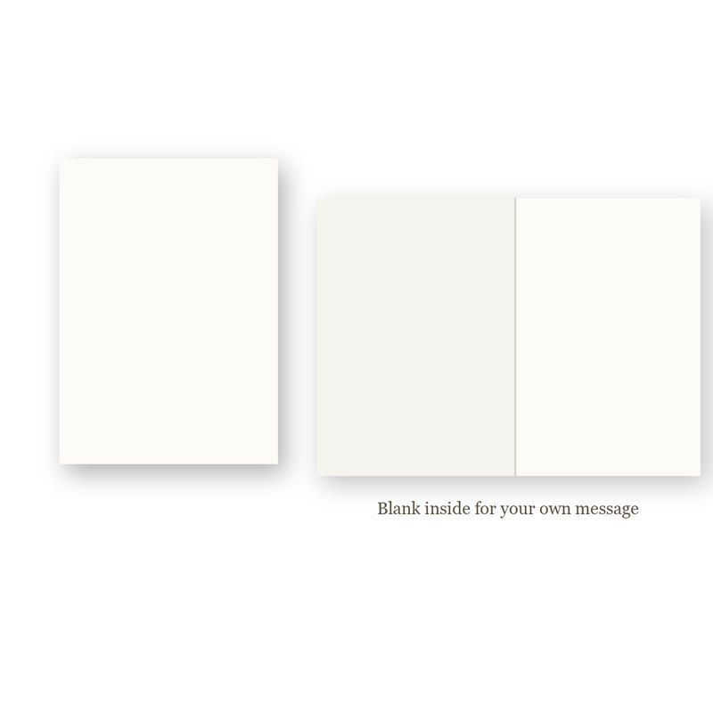
- Blank inside for your own message
- Kraft envelope included
- Printed to order
- Paper weight: 350 g/m²
$3.95 flat shipping per order, free on orders of $25 or more. Cards are printed to order: 2–4 business days to print and pack, then 3–5 business days in transit (5–9 business days in total). We ship within the United States only.
Return unwritten cards within 30 days of delivery. Damaged or misprinted? We replace or refund it free. Read our Shipping Policy and Returns & Refund Policy.