 1 / 3
Eat Sleep Poop Card: Bold Typography Greeting
Eat Sleep Poop Card displays the phrase EAT. SLEEP. POOP. in heavy black font to celebrate the honest, unglamorous rhythm of everyday existence.
Shipping from $3.95
- Arrives in 5–9 business days$3.95 shipping · Free over $25 · Order before 2 PM ET to ship sooner
- 30-day returnsUnwritten cards, original condition. Learn more
- Secure checkout: cards & PayPal
Eat Sleep Poop Card shows the phrase EAT. SLEEP. POOP. in bold black letters and captures the simple cycle of daily life with humor. This design uses stark typography to highlight the universal routine that everyone understands, making it a relatable choice for those who appreciate blunt honesty over fancy platitudes. Sending this card acknowledges the shared reality of basic biological functions in a way that feels genuine and unpretentious, and it was made for the friend who values truth over politeness.
Ships with a kraft envelope; envelope color in photo may vary.
What the print says
The artwork presents three distinct commands stacked vertically in a heavy, blocky sans-serif font that dominates the center of the white space. Each word ends with a period, creating a rhythmic and definitive cadence that emphasizes the non-negotiable nature of these actions. The high contrast between the deep black ink and the clean paper ensures the message is impossible to miss or misinterpret. This minimalist approach belongs to the genre of typographic humor where the visual weight of the text carries the entire comedic load without relying on illustrations or decorative elements.
Who sees themselves in it
People who use an Eat Sleep Poop Card usually have a close relationship with the recipient based on mutual comfort and lack of pretense. You might send this when you want to thank someone for being a good friend without getting overly sentimental or serious about it. It fits perfectly into casual exchanges between roommates, siblings, or coworkers who enjoy banter that cuts through social niceties. The design serves as a low-stakes way to maintain connection through shared laughter about the mundane parts of being human.
- Why are there periods after each word in the design?
- The periods create a strict, staccato rhythm that mimics a military command or a set of rules. This punctuation choice reinforces the idea that these three actions are mandatory cycles rather than optional activities. It adds a layer of deadpan authority to the joke, making the blunt statement feel more structured and intentional than a casual sentence would.
- Is this card suitable for professional settings or bosses?
- This design is generally too crude for professional environments or superiors due to the explicit vocabulary used. It is best reserved for close friends, family members, or peers who share your specific sense of humor and comfort level with bodily function jokes. Using it in a workplace could easily be misunderstood or cause offense rather than amusement.
- How does this compare to other funny thank you cards?
- Unlike cards that use puns, illustrations, or complex metaphors, this design relies solely on the raw impact of the text itself. Most humorous cards try to be clever or visually engaging, whereas this one embraces a minimalist aesthetic that lets the absurdity of the statement stand alone. It differs by stripping away all decoration to focus purely on the universal truth of basic survival needs.
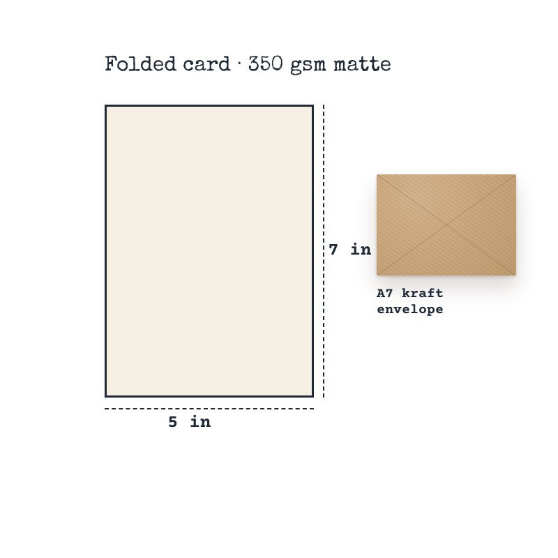
- Premium 350 gsm cardstock
- Full-color print on demand (front)
- Folded 5 x 7 in (A7) card
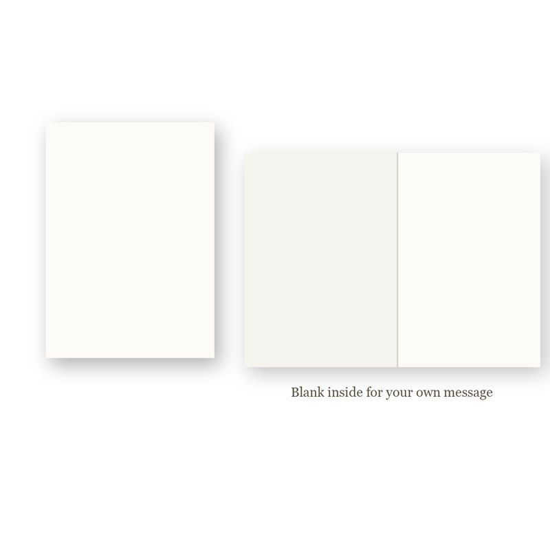
- Blank inside for your own message
- Kraft envelope included
- Printed to order
- Paper weight: 350 g/m²
$3.95 flat shipping per order, free on orders of $25 or more. Cards are printed to order: 2–4 business days to print and pack, then 3–5 business days in transit (5–9 business days in total). We ship within the United States only.
Return unwritten cards within 30 days of delivery. Damaged or misprinted? We replace or refund it free. Read our Shipping Policy and Returns & Refund Policy.