 1 / 3
Colorful Serif Kraft Farewell Card for Rude Coworker Goodbyes
Colorful Serif Kraft Farewell Card displays a screamingly funny goodbye message in retro typography that captures the true feeling.
Shipping from $3.95
- Arrives in 5–9 business days$3.95 shipping · Free over $25 · Order before 2 PM ET to ship sooner
- 30-day returnsUnwritten cards, original condition. Learn more
- Secure checkout: cards & PayPal
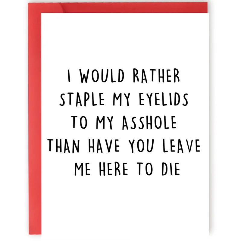
Colorful Serif Kraft Farewell Card shows the phrase I would rather staple my eyelids to my asshole than have you leave me here to die, and this bold declaration turns office heartbreak into a hilarious scream. The design uses stacked typography in red, yellow, black, and blue to emphasize the dramatic sentiment of being left behind. It is made for the person who needs to say they are devastated without sounding polite or sincere.
Ships with a kraft envelope; envelope color in photo may vary.
What the design tells
The artwork presents a vertical stack of capitalized letters in varying weights and colors that dominate the white space. The word Staple is flanked by small motion lines, while Rather is decorated with starburst icons to add visual rhythm to the layout. Black, red, yellow, and blue ink creates a retro palette that makes the crude message pop off the page. This style belongs to the genre of sarcastic workplace humor where exaggerated emotion replaces professional decorum. The combination of vintage font choices and modern slang creates a unique aesthetic for saying goodbye.
People who will use it
You will find this Colorful Serif Kraft Farewell Card ideal for the colleague whose departure feels like a personal tragedy wrapped in a joke. It fits perfectly into a group card where everyone wants to sign but no one wants to be the first to admit they are actually sad. The everyday moment for this design is handing it over during a final handshake or slipping it onto a desk before the last shift ends. It transforms a painful transition into a shared laugh that only your specific team would appreciate.
- What does the phrase on the card actually mean?
- The phrase uses extreme hyperbole to express that the sender would endure physical pain rather than face life without the recipient. It is a comedic inversion of typical polite farewell sentiments, signaling that the bond is strong enough to warrant such an absurd threat. The humor comes from the gap between the violent imagery and the underlying message of deep affection and reluctance to see the person go.
- Who is the target audience for this specific design?
- This design targets employees who share a close, informal relationship with a coworker who is resigning or transferring. It suits people who prefer blunt honesty over corporate pleasantries and enjoy dark humor in their daily interactions. If your office culture allows for swearing and self-deprecation, this card is tailored specifically for your dynamic rather than a formal business network.
- How should this card be used during a leaving celebration?
- Use this card as the centerpiece of a farewell gift or as a standalone note tucked inside a larger package. It works best when paired with other genuine sentiments because its intensity acts as a comedic anchor. Since the message is so specific to your shared history, it validates the unique connection you have built over time while making the others around you smile at the audacity.
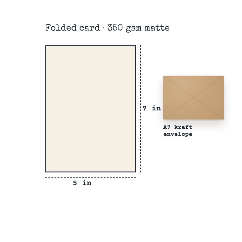
- Premium 350 gsm cardstock
- Full-color print on demand (front)
- Folded 5 x 7 in (A7) card
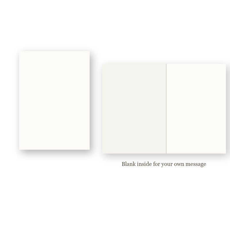
- Blank inside for your own message
- Kraft envelope included
- Printed to order
- Paper weight: 350 g/m²
$3.95 flat shipping per order, free on orders of $25 or more. Cards are printed to order: 2–4 business days to print and pack, then 3–5 business days in transit (5–9 business days in total). We ship within the United States only.
Return unwritten cards within 30 days of delivery. Damaged or misprinted? We replace or refund it free. Read our Shipping Policy and Returns & Refund Policy.